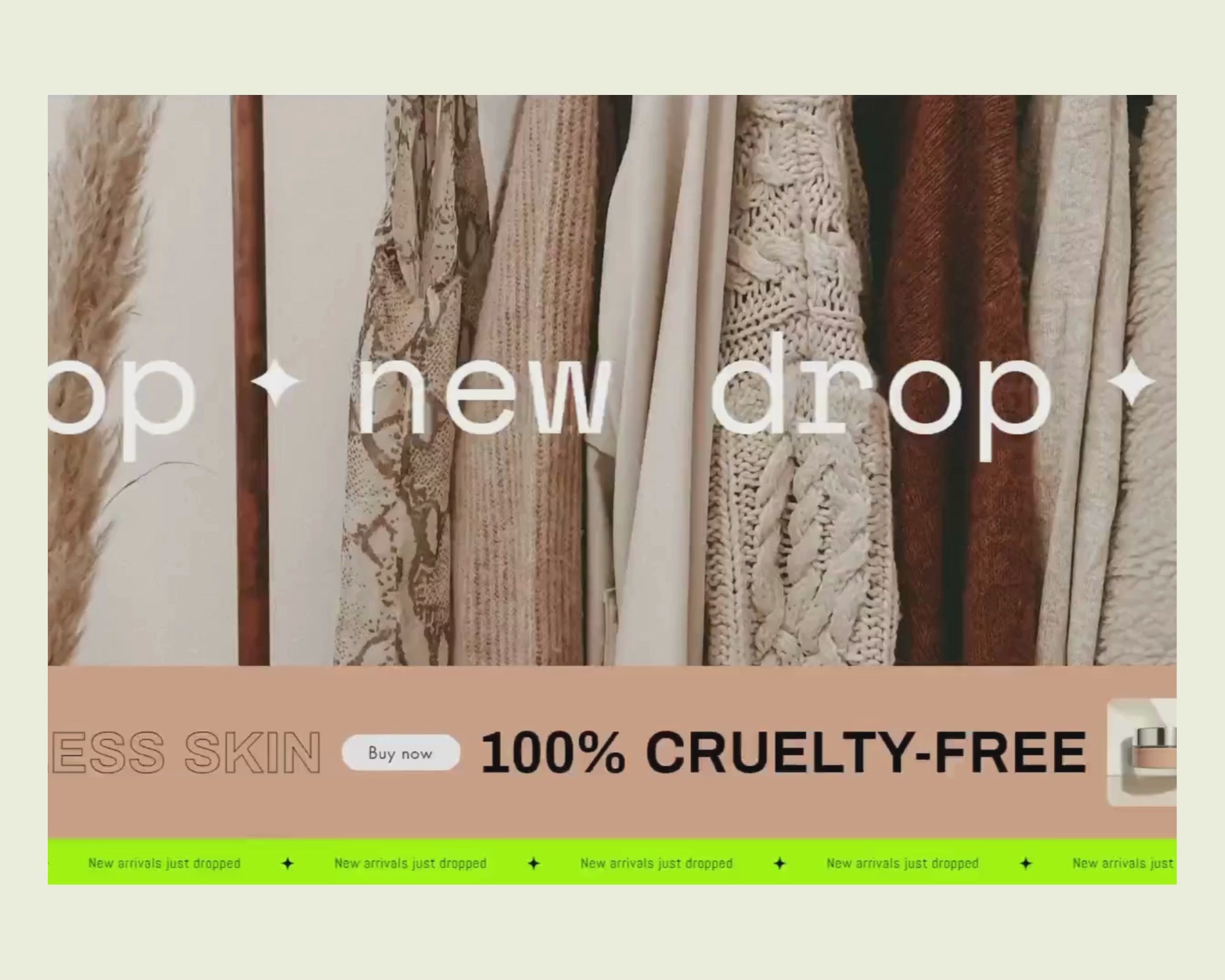
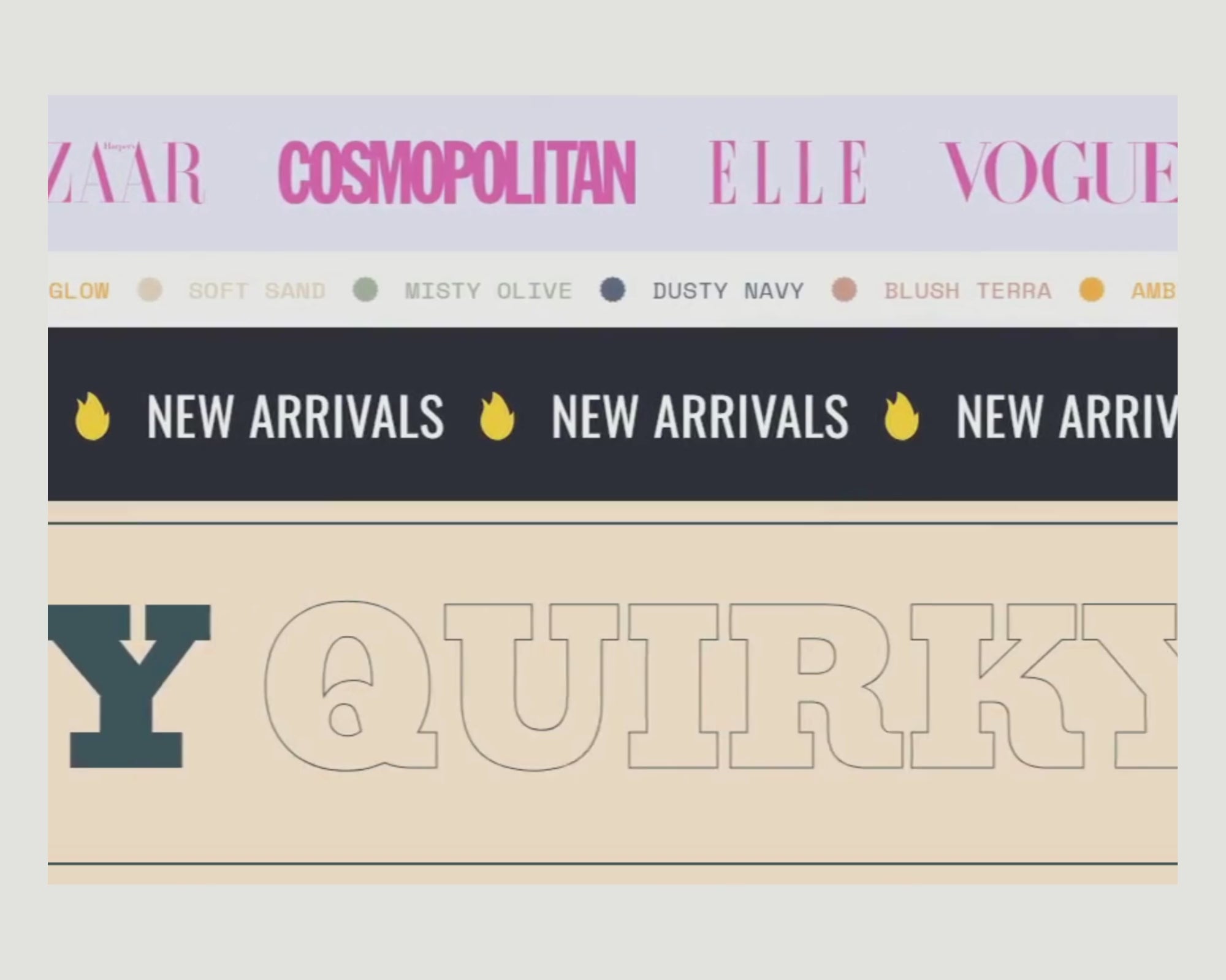
Kompletní seznam možností úprav pro Scrolling Marquee Section
General Layout & Behavior
- Scroll Direction – Choose between left-to-right or right-to-left scrolling for desired flow.
- Scroll Speed – Set animation speed for full control over pacing.
- Pause on Hover – Pause the scrolling animation on hover for better interaction.
- Auto-optimized based on the number of blocks for smooth repetition.
Spacing & Responsiveness
- Space Between Items – Set gap spacing independently for desktop and mobile.
- Section Padding – Customize top and bottom padding to control content breathing room.
- Section Margins – Adjust outer margins to manage vertical spacing from other sections.
- Mobile Optimization – All gaps, font sizes, and paddings adapt for tablet and phone views.
Background & Overlay Settings
- Background Image – Upload different background images for desktop and mobile.
- Gradient Option – Replace background images with a smooth gradient effect using theme color pickers.
- Solid Background Color – Set a flat background using any hex or theme color.
- Overlay Enable – Add a color overlay layer over image or color backgrounds.
- Overlay Opacity – Adjust transparency level of overlays from 0% to 100% for visual balance.
Border Customization
- Top & Bottom Borders – Toggle visible border lines above or below the section.
- Border Color – Choose any custom border
- Border Thickness – Define line weight.
Content Block Types & Styling
Text Blocks
- Rich Text Content – Add and style paragraphs or headlines using HTML or plain text.
- Font Sizing – Control font size separately for desktop, tablet, and mobile.
- Text Color – Choose any text color that fits your palette.
- Uppercase Toggle – Automatically capitalize all letters for impact.
- Text Outline Effect – Add outlined typography with custom stroke color.
- Custom Font Support – Use theme fonts or upload custom typefaces.
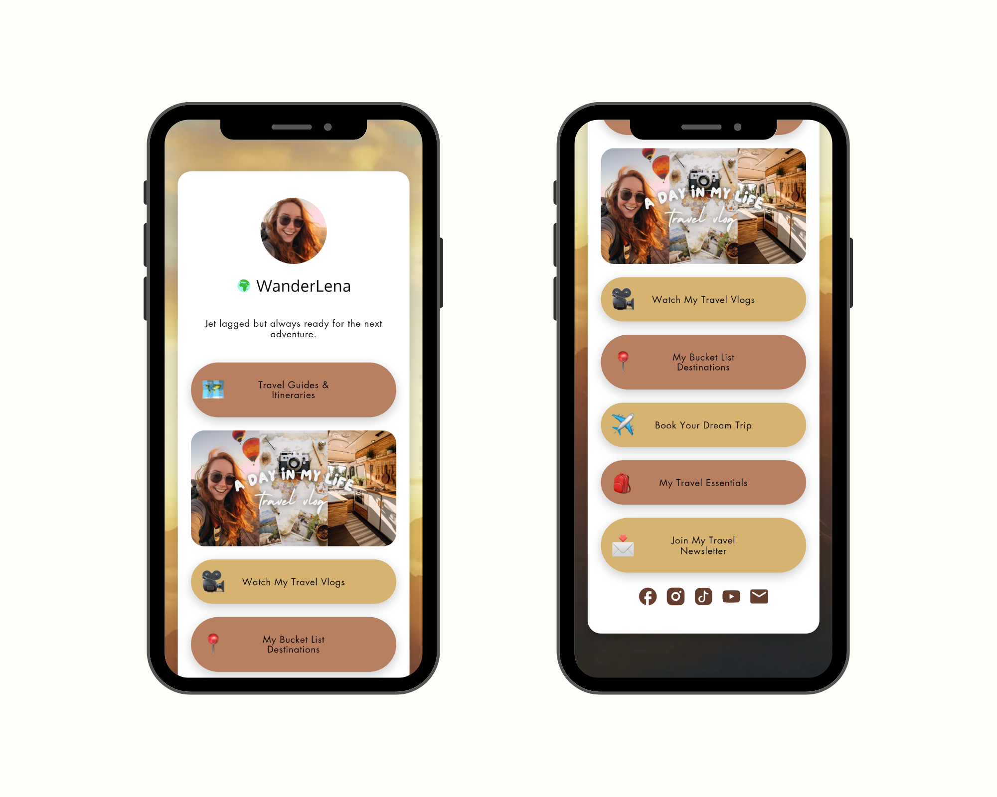
Button Blocks
- Button Text & URL – Customize button label and link destination.
- Size Options – Choose from small, medium, large, or extra-large button dimensions.
- Button Shapes – Rectangle, rounded, pill, or full oval shapes available.
- Color Customization – Set background, border, and text color for both default and hover states.
- Text Size – Individually control text size for desktop, tablet, and mobile.
- Button Hover Animations – Choose from “Pan,” “Hyperion,” “Mimas,” “Kari,” or basic transitions.
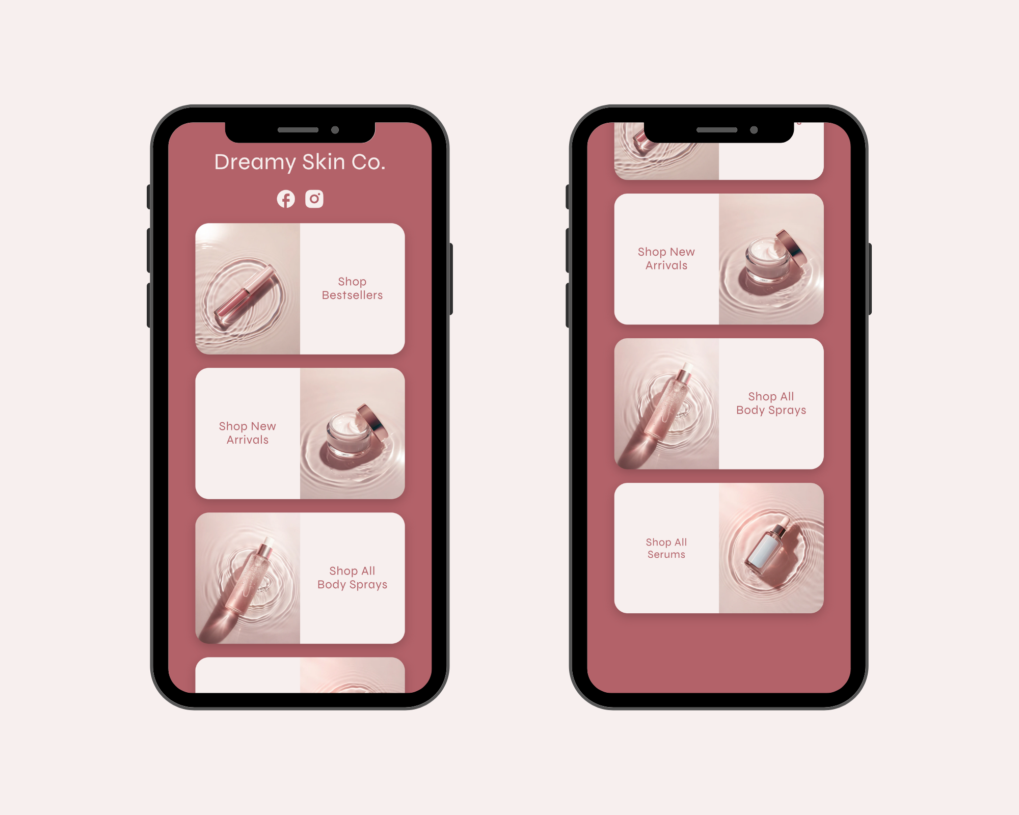
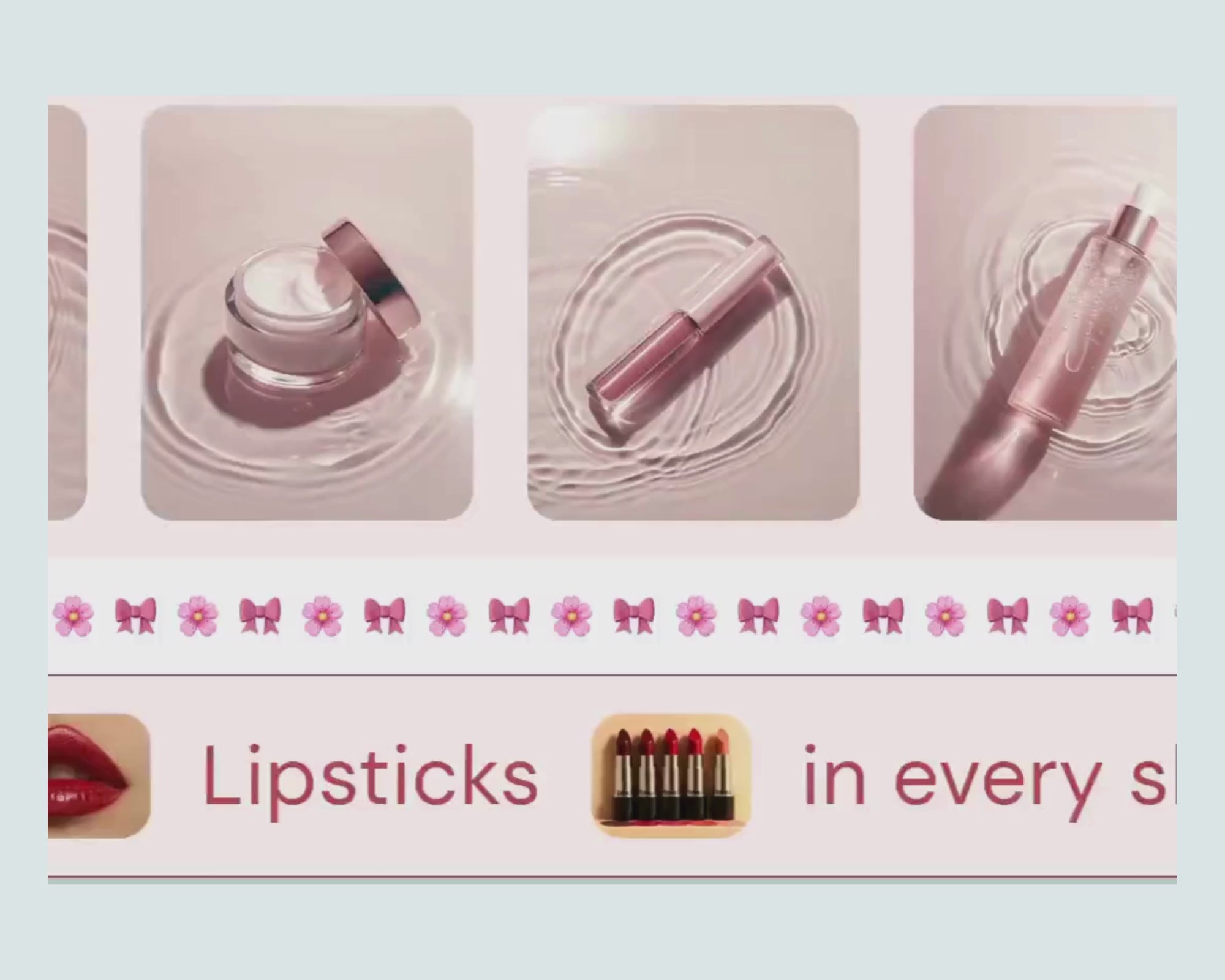
Image Blocks
- Image Upload – Add high-quality images to scroll horizontally.
- Image Height – Define image display height for desktop and mobile separately.
- Clickable Option – Turn images into clickable links by adding a destination URL.
- Image Border Style – Choose from rounded-large, medium, small, or square corners.
Image + Text Combo Blocks
- Layout Direction – Position image on top, bottom, left, or right of text.
- Flexible Spacing – Adjust spacing between image and text for desktop and mobile.
- Shared Customizations – Inherits all image and text customizations listed above.