
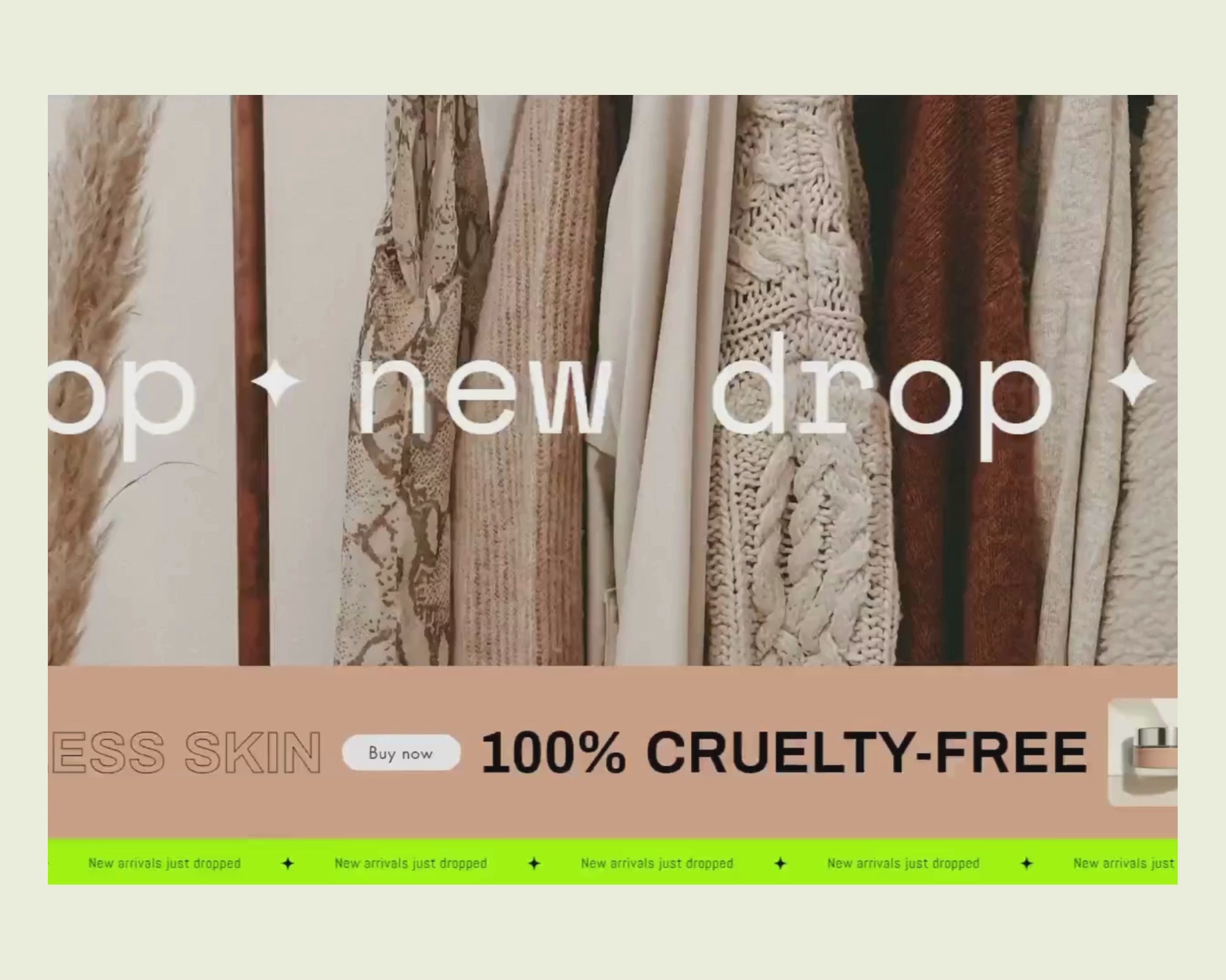
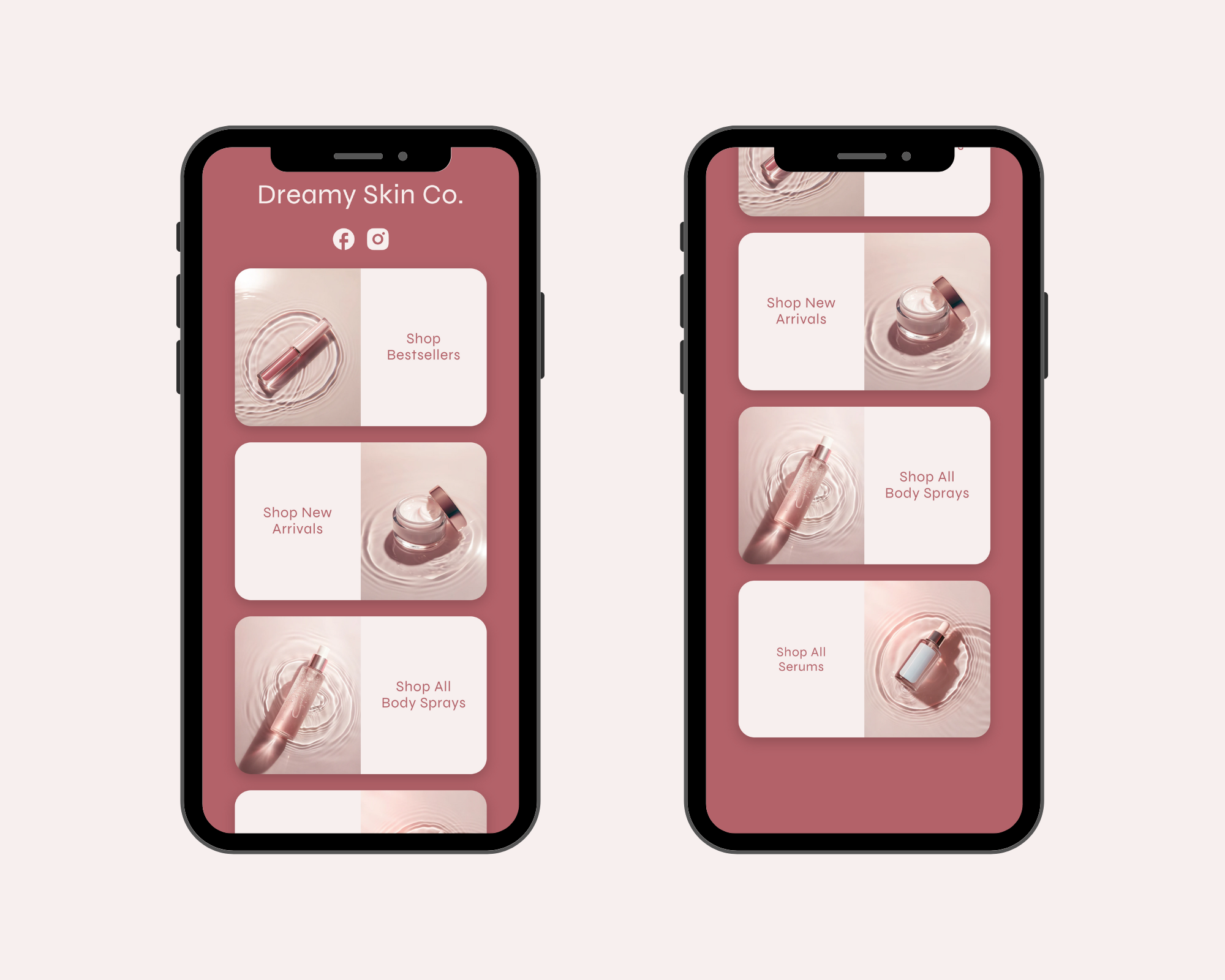
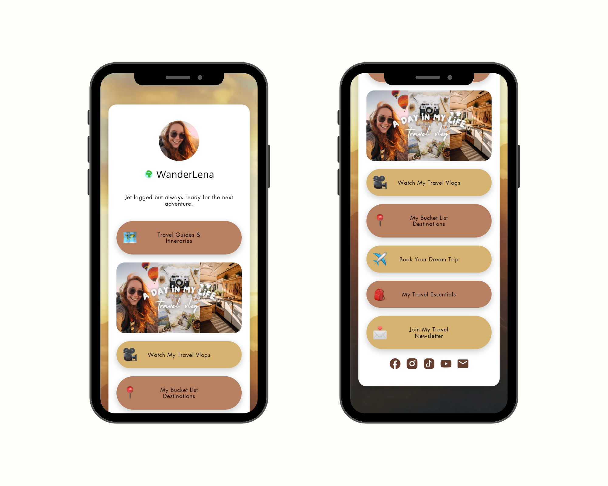
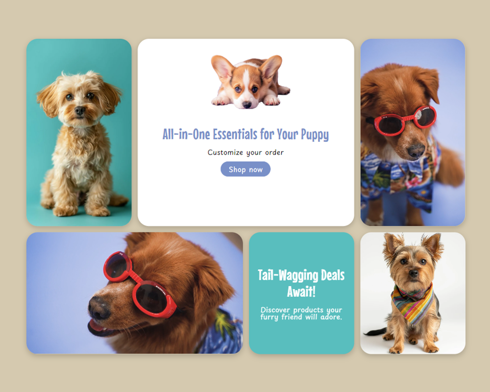
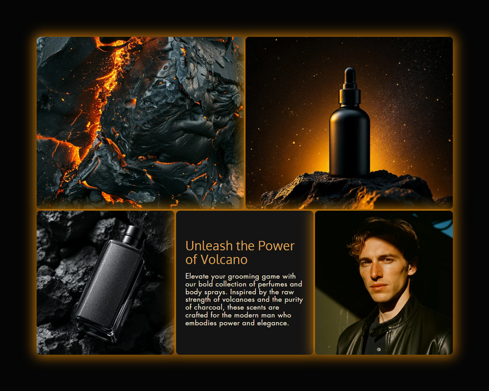
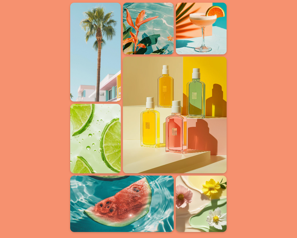
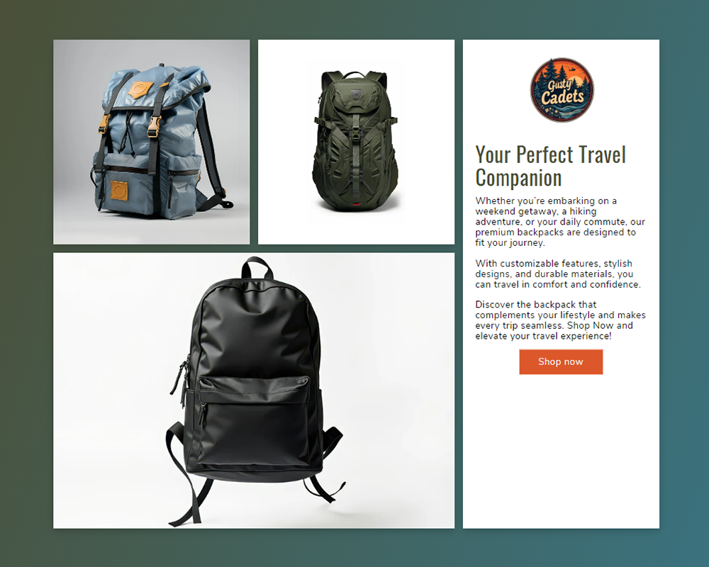
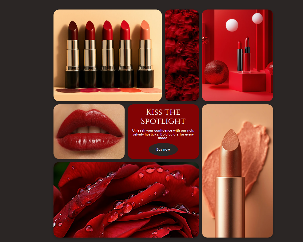
Kompletní seznam možností úprav pro Bento Grid Section
Grid Customization
- Number of Columns: Choose between 3, 4, or 6-column layouts to match your design preference.
- Spacing & Gaps: Adjust gap sizes for desktop and mobile for a clean, structured appearance.
- Full-Width Option: Enable full-width display for an immersive grid experience.
- Padding & Margins: Fine-tune section spacing with customizable padding and margins.
- Box Shadows & Borders: Add depth and contrast with shadow effects and adjustable border styles (rounded, square, etc.).
Background & Overlay Customization
- Background Image: Set a different image for desktop and mobile for optimized performance.
- Gradient or Solid Color: Choose a custom background color or a stylish gradient effect.
- Overlay Effects: Add a color overlay with adjustable opacity for a more dynamic look.
Image & Video Customization
- Flexible Positioning: Place images and videos on top, bottom, left, or right within the grid.
- Background or Content Image: Choose whether to set images as a background or as a content block.
- Cover or Contain: Scale images dynamically to either cover the grid area or fit within it.
- Video Support: Add videos with Shopify-hosted content and enable looping playback for seamless viewing.
Text Customization
- Custom Headings: Add titles and adjust font size separately for desktop, tablet, and mobile.
- Text Alignment: Align text to the left, center, or right for a balanced layout.
- Custom Colors: Change the text and heading colors to match your brand.
- Multiple Heading Tags: Choose from H1 to H6 for SEO-friendly structuring.
Button Customization
- Customizable Text & Links: Set button labels and link them to any page.
- Various Shapes & Sizes: Choose from rectangle, rounded, pill, or oval buttons in small, medium, large, or extra-large sizes.
- Hover Animations: Apply unique hover effects such as pan, hyperion, mimas, and kari for interactive buttons.
- Custom Colors: Adjust button fill, border, and text colors for both normal and hover states.
Fully Responsive & Optimized
- Mobile & Tablet Adjustments: Customize grid spacing, text sizes, and padding separately for mobile.
- Stacked Layout on Mobile: The grid automatically stacks items vertically on smaller screens for better usability.
- Lightweight & Fast-Loading: Optimized code ensures quick performance without slowing down your store.